YouTube Case Study Thumbnail
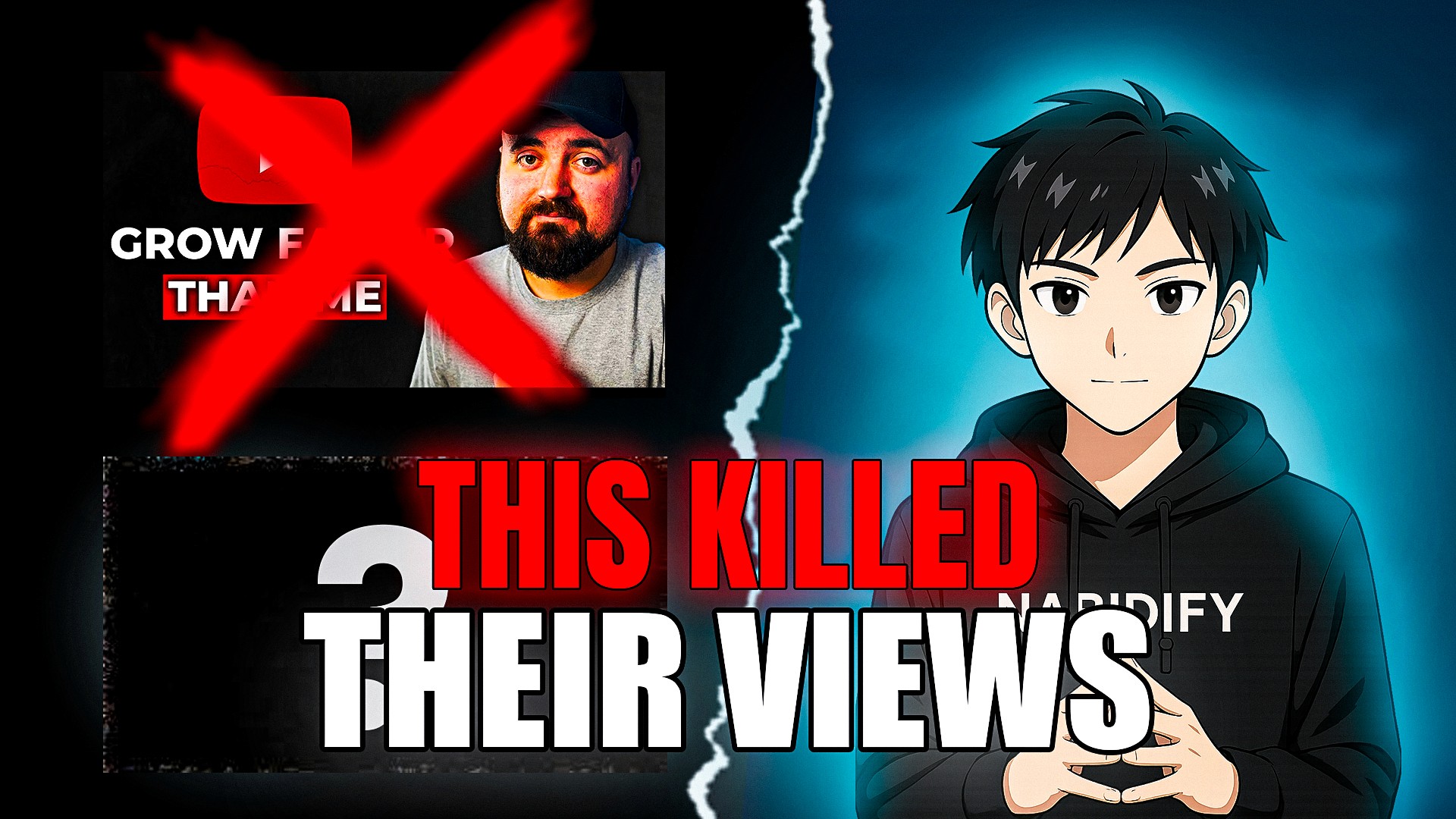
The Challenge
The creator's long-form case study videos were performing below channel averages on the impressions-to-clicks ratio. Strong content was being undermined by thumbnails that failed to communicate the payoff of watching.
In the case study niche, viewers scan for credibility and a concrete result. The existing thumbnails buried both under cluttered text and low-contrast imagery.
The design had to stay readable at the smallest feed sizes while competing against creators with far larger production budgets.
Strategic Solution
I led with a clean expression cutout — high-energy but credible — isolated against a simplified background to create an immediate focal point. Visual noise was stripped back so the eye lands in one place first.
The text overlay was reduced to a short, high-contrast result statement using a bold sans with strong stroke separation, ensuring legibility on mobile feeds.
A deliberate color-contrast system separated subject, result text, and background into three readable layers, tested at multiple scales before delivery.
Deliverables & Outputs
Impact & Outcomes
- Increased video CTR from 4.2% to 9.1%.
- Video outperformed the channel's 90-day average within its first week.
- Thumbnail system rolled out across the creator's case study series.
Next Project

YouTube Growth Thumbnail
YouTube Thumbnail